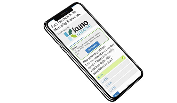
Quiz Asset

At the time of this project, two large company goals were: to start thinking more responsively with our content across mobile and to develop revenue drivers for the business to meet aggressive financial company goals. This new asset type was intended to meet both by being mobile-forward and strategically interesting to advertisers who would want to sponsor it.

Roles:
User Research
UX Design
UI Design

problems:

Engage the user

eMarketer produced lots of traditional content, but lacked in engaging users in new ways.

}
Think responsively

The company didn’t have a strong mobile profile

}
Raise ad dollars

The ad sales team needed an asset type they could sell sponsorships on

}

goals:

To validate and produce a new asset that would be interesting and engage the user

To come up with content that performed well on desktop as well as mobile devices

To create an asset type that sponsorships could be sold against and advertisers would love

process:

Background

  • I did a study and presented several mobile-forward concepts to the leadership team. One of those concepts was a quiz.
  • Many sessions with our users showed that they need content that is:
    • quality, trustworthy and recent (since they are often reusing data in their own presentations to coworkers or clients).
    • engaging to pique and keep their interest (in jobs where information and communication overload is common).
    • quick and easy to consume (since many only have a few minutes a day max to devote to checking out new content).
  • The quiz could go a step farther than the traditional eMarketer content (editorial, charts, data points, etc.) since it was interactive and ‘fun’.

Research

  • A competitive analysis led to the conclusion the quiz should be:
    • Clean with one task at a time.
      1. Prompt to begin
      2. Single questions one after the next
      3. Simple results page and optional next steps
    • Informative with feedback based on the response given.
      • Beyond the obvious correct or incorrect indication, users crave feedback and more information/context after they input an answer.
      • The key is to provide the context without making it feel like an extra step on every question.
    • Flexible so as to let the user feel in control.
      • It was important that users felt in control and free to navigate around instead of stuck in a one-track sequence.
      • Elements were added to let users go to the previous or next (once an answer was selected) at any point. Previously entered responses could not be edited, but they could be accessed.
    • Valuable.
      • After the quiz is completed, the user gets more value in the form of their score, which is shareable, and an in-depth whitepaper about the subject matter.

Learnings

  • In usability sessions, many ideas were validated and some were introduced as well:
    • Progress indication:
      • Users liked knowing where they were in the process with a progress bar and “X of Y” pagination.
    • More context:
      • When displaying it after each question versus providing all context grouped at the end, users told us they preferred the former because it felt more relevant and they could be learning the whole way. Links were included to eMarketer published material to delve deeper on the subject.
    • Results page:
      • Displaying the score was valuable but many users liked a comparison module where they could see how others who took the quiz scored. They reported that this section would encourage them to share the quiz. Also, including a whitepaper about the subject matter at this point was widely well-received.

Hurdles overcome

  • Since this product would be accessible on the web via any device, it would not be exclusively mobile. I was able to make the point that a mobile strong platform should be more of an all-inclusive of every device approach than a targeted effort at a particular sect.
    • To encourage interaction from a mobile audience, it was promoted in newsletters, which users access from all types of device.
  • In order to get closer to the EBITDA goal, the quiz would have to be monetized. To accomplish this, questions were written around the content of a sponsored report and download of this report required some information from users.

results:

Goal: To validate and produce a new asset that would be interesting and engage the user

Users have been interested in the new asset type and have engaged. The click-through-rate for quizzes in newsletters is higher than any other asset type.

Goal: To come up with content that performed well on desktop as well as mobile devices

This content type was the first designed mobile-first and has led the way for other responsive development.

Goal: To create an asset type that sponsorships could be sold against and advertisers would love

With sponsorship in place, quizzes were sold at $25k each and have continued to sell to advertisers month after month.

**
Usability sessions (30min call/screen share):
  • ≈ 5-10min interview Q&A.
  • Rest of time looking at the website, product, prototypes (axure, html, flat comps etc.) and talking through ideas.
  • Screen share/pass presenter role to user in session to make as authentic experience as possible.
  • Sometimes had stakeholders in the room to see the findings for themselves (this helped facilitate compromise and best UX possible later down the line).