Public Site Asset Pages

The marketing team was working hard to develop leads for sales, but organic inquiries could only come from a few places—referrals or cold calls. I proposed we take a new approach and build content preview pages to give non-customers an idea of what we offered behind the paywall and to allow Google index our pages as well. It was a hard sell to the business that took months just to get the 'OK' to test, but in the end the project was hugely successful.

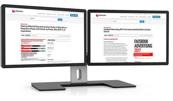
View design work from this project

Roles:
User Research
UX Design
Visual Design

problem:

The Paywall Paradox

All PRO (subscription) content was completely hidden behind the paywall.
Potential new customers had no way of knowing what content was in PRO and were very unlikely to organically inquire.
Users could only preview the content if they:
  1. Were already a PRO subscriber
  2. Endured an hour-long sales demo call
≠ lead generation

goals:

To grow a new user base of customers who didn’t already subscribe to eMarketer by designing content experiences accessible without a login.

To create incentive for non-customers landing on these pages to subscribe.

To improve SEO and findability of eMarketer content overall

process:

Background

  • The new public facing asset pages had to maintain a balance of and take into consideration:
    • enough content and correct content to for Google to find and serve in their results.
    • enough value to users who landed on them organically to not bounce.
    • not so much content given away for free so the business didn’t feel like it was missing out on potential revenue.
    • not so much given away that a PRO subscription loses any value to potential new buyers.
    • not so much given away that current paying customers feel they are being conned (“Why am I paying for this if you’re giving it away for free?”).
    • an experience that would drive users to want more and then inquire.
  • Wanted to develop the narrative that:
    • eMarketer PRO has the high-quality information you need.
    • subscribing to PRO would be valuable.

Exploration

  • I designed, tested and optimized many iterations in process of:
    • designing prototypes to a high enough fidelity that users could accurately provide feedback.
    • leading the usability sessions with current customers and non-customers to gauge the interest and value of these pages and elements on the page.
    • vetting successful concepts with business stakeholders and showing how users engaged.
  • There were a variety of asset types that would need to be validated (reports, charts, interviews, briefs).
    • Each asset would need to play on its strengths and showcase its value.
  • Especially with reports, we wanted to demonstrate high quality and value by:
    • listing all of the charts, and interviews that were included and that were sourced to reach conclusions (which would be linkable to those public-facing asset pages).
    • including the Executive Summary of the report, which gives the high-level gist of it.
    • including the first chart from the report as an example.
    • including the table of contents to be transparent about areas explored.

Concerns

  • The business was very against ‘giving away anything for free’ to non-customers.
    • Concerns that publishing content that previously required a subscription might jeopardize the value of the paywall concept that the company was built around.
  • It would be a huge undertaking. eMarketer has tens of thousands of assets, so to test the idea and get quantitative data would require lots of energy.
    • Implementation time, SEO monitoring, and adequate analytics tracking were all concerns.
  • How would chart pages provide value?
    • Charts don’t have any written description to include.
    • The business refused to let us include any real data points in the “preview” public facing pages.
    • Charts currently are images; aka not SEO friendly.

Hurdles overcome

  • Received feedback that truncating an asset made it seem like very short (& less valuable) content instead of a preview of a bigger story.
    • Visual solution: gradient over the end of the previewed content
    • Interaction solutions: large gray button “what else is included” button to anchor to list of reports and interviews included inside and report cover image turns into a prompt to inquire about PRO onScroll
    • Highest engaged element on the page and users said it enticed them to click
    • UX elements: validated the importance of messaging (“Preview from eMarketer PRO”) at the top of the asset, integrated CTAs at “dead ends” to encourage subscription inquiry
  • Through observed actions and from prompting users were asked to assess the value add of public facing content pages in order to assuage business concerns about giving away free content.
    • The value of showcasing a bird’s eye view of everything eMarketer PRO has behind the paywall and showing how each asset had something useful was much higher than the fear of losing value by opening it up to the public.
  • To tackle the problem of the test affecting so many pages, we created a plan:
    • at first, only charts published in free daily articles would have their own pages (no “preview” charts yet).
    • after we saw user engagement with those, report pages were published followed in staggered stages by briefs, interviews, then the rest of the charts.
    • had to monitor number of new pages created at once in order to not hurt SEO.
  • Analytics were carefully monitored (Omniture) to ensure I could prove that these were a success to the business at periodic check-ins.
    • Validated through testing that including a title, measurement info, topics covered and a chart image with no data points was valuable enough to users to tell a story and make them want more.
    • Writing these on the page was enough for Google to index and serve the pages.
  • Experimented with single column and dual column approaches:
    • single column was effective for telling a story piece by piece.
    • dual column was effective on the report page for telling a story but providing an aside.

Asides

  • Ad supported vs. no ads on page was a question.
    • The ad team saw opportunity in thousands of new pages that could have ads on them.
    • The product team wanted to minimize ads and focus on clean experiences.
    • After much testing, ended up agreeing that if the page goal was to promote and sell our product, it would have no ads, otherwise it could.
  • Inter-linking related content sections were included on these new pages to encourage users to view more assets thus strengthening the case for PRO.

results:

Goal: To grow a new user base of customers who didn’t already subscribe to eMarketer by designing content experiences accessible without a login.

After many prototypes, usability sessions and months of calculated rollout, the public facing asset pages proved to be a huge success:

  • Inquiries went up by 34% per month on average.
  • New subscription revenue went up my 54% (this project was a major contributor, but not wholly responsible).
  • In May 2017, the combined asset pages created in this project had a total of 47,000 unique visitors and 675,000 page views for the month.
  • According to the head of analytics, the "biggest increases from 2016 to 2017 were among Asset Page Inquiries"

Goal: To create incentive for non-customers landing on these pages to subscribe.

With user-validated tactics like content preview and searchability in the unauthenticated site experience, non-customers were now aware of what content eMarketer had to offer and thus incentivized to inquire about subscribing.

Goal: To improve SEO and findability of eMarketer content overall

Thousands of content assets previously only visible to logged in users were now viewable by anyone, including Google. SEO benefitted greatly from this.

**
Usability sessions (30min call/screen share):
  • ≈ 5-10min interview Q&A.
  • Rest of time looking at the website, product, prototypes (axure, html, flat comps etc.) and talking through ideas.
  • Screen share/pass presenter role to user in session to make as authentic experience as possible.
  • Sometimes had stakeholders in the room to see the findings for themselves (this helped facilitate compromise and best UX possible later down the line).